Analyzing the User Interface of the Swisscharge App
The Swisscharge app enables electric car drivers in Switzerland to locate charging stations and charge their electric cars. In the fall of 2025, a new version was released on the Apple App Store, which received In this case study, I highlight the problems with the redesign and present my approach to solving them.
Unfortunately, the first impression is somewhat marred by the fact that the text below the is much too long and is cut off awkwardly (at least on my device). Furthermore, the Swisscharge logo is pixelated when the app is launched.
Once inside the app, it quickly becomes clear that this is not a minor UI update, but a massive upgrade that probably relies on completely different technologies in the background.
A comparison of the two versions: and
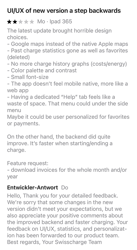
Often, such a radical redesign prevents a smooth user experience. The App Store is filled (tip: sort by new reviews) with reviews from users who can no longer successfully charge their cars with the new app, take longer to find the desired charging station, or have lost all their favorites and past charging processes.
I have summarized most of the app's features in a section and will now guide you through the redesign, my critique and my solution.
Filter for a Suitable Charging Station
The plugs
There are too many plugs available as filters, which means they take up too much space. For example, 'NEMA' is not used in Switzerland and 'Induction' is not yet relevant.
Order of filter options
Options such as minimum power, AC/DC, and availability filter at a higher level than the plugs. Accordingly, these options should appear first.
Native elements
An iOS26 sheet (UI element that appears from the bottom of the screen) is more suitable than a menu from the right because it is easier to close.
Missing legends
Not all users will understand what a roaming station is, so this should be explained clearly.
New filter order
The filters are now arranged so that those that have the greatest influence on the stations to be displayed are shown at the top. First is the charging power, followed by availability and conditions, and finally the individual plugs, with Type 2 and CCS already covering the majority of all stations today.
Charging power
Four predefined options make selection easier.
Legends
Many filter options now have a short explanatory text, so it is now clear what exactly the corresponding option does.
Original
Redesign
Details of the Selected Charging Location
Language consistency
There is English text in the German interface, which is not only very small, but also probably irrelevant or not yet relevant. For example, I don't see a price, but I do see the contract used to bill my charge.
Icon size
The icon and its container take up an enormous amount of space. In Switzerland, Type 2 and CSS are almost the only relevant connections for charging electric cars, so the icon does not need to be given such prominence here.
Link consistency
'Start navigation' and 'Display' are both links, but they look different.
Labeling
The label of the 'Display' link is very superficial. What should be displayed here? Ideally, the link should clearly communicate where it leads, e.g., 'Charging point details' or 'Continue to charging.'
Visual priority
The navigation icon is green, but unlike the availability indicator, it is not nearly as important, yet it competes with it visually.
Station ID
The station ID is extremely small, but it can often be useful for confirming that you are at the correct charging station.
Color meaning
The 'Occupied' color is similar to orange, but should be clearly distinguishable from it visually, as it symbolizes a warning.
Redundant actions
'Scan QR code' is already found in the main navigation, and if I am already on this detail view, I have already found the correct station and no longer need to scan a code.
Availability indicators
As a user, I must be able to assume that a station is always available. This means that my design only marks exceptions with red text, which also helps to calm the interface somewhat and keep the number of colors in the interface low.
Contact accessibility
The phone number cannot be called directly, so the user has to remember the number and enter it manually on their cell phone!
Information hierarchy
The price appears visually almost the same size as the station ID. Just before starting a charging process, I would argue that this information is extremely important and deserves a corresponding place in the hierarchy.
Call to action
As a link, 'Change' competes with the main call to action and should be less visually prominent.
Units of time
'Duration of free time' is given in minutes. But for us humans, hours are easier to understand.
Price clarity
It is not entirely clear that the 'price per 1 min' only starts after the free time. It could be a different charge; in electric mobility, blocking charges or overload charges are already a reality.
Original
Redesign
Start a Charging Session
Phone functionality
The phone number cannot be called directly, so the user has to remember the number and enter it manually on their cell phone!
Price prominence
The price appears visually almost the same size as the station ID. Just before starting a charging process, I would argue that this information is extremely important and deserves a corresponding place in the hierarchy.
Button hierarchy
As a link, 'Change' competes with the main call to action and should be less visually prominent.
Time formatting
The 'duration of the free period' is given in minutes. However, hours are easier for us humans to understand.
Fee transparency
It is not entirely clear that the 'price per 1 min' only starts after the free period.
Visual hierarchy
The content is now clearly structured according to location, support, fees, and payment.
Charging prices
The price for charging is clearly visible, and it is now clear when and at what price blocking fees will be charged.
Accessible Links
One click on the link directly initiates a call. In addition, office hours are now clearly displayed.
Call to Action
The main action—starting a charging process—is now more prominent than changing the payment option.
Original
Redesign
Receipts for Previous Charges
Empty states
If no results are available for the current period, an automatic switch to 'Duration: All' can prevent the screen from remaining empty.
Repetition
Main title is repeated twice and therefore has limited value.
Date formatting
The date and time looks like they were taken directly from the database. However, humans prefer a more readable format such as July 26, 2024, 12:27 PM.
Icon consistency
Various arrows in different sizes and thicknesses are used, such as the normal arrow and the chevron arrow.
Lack of main action
It is not immediately obvious where to tap on this screen, as there is no obvious primary action.
Filter by date
The Switch UI is easier to use than the dropdown and all options are immediately visible.
Improved overview
Whereas previously only two past sessions were visible on my screen, thanks to a space-saving measure, four are now visible.
Charging statistics
By removing the decimal places for the kWh charged and arranging the symbols vertically, we gain more space for the charging processes below.
Obvious main actions
Filtering by date or downloading receipts are the most important actions that can be performed on this screen.
Original
Redesign
Favorite Charging Stations
Visual hierarchy
It is difficult to see which of the stored charging points belong together as a unit.
Information density
With a large number of favorites, you have to scroll vertically a lot, as individual charging stations take up a lot of space.
Management
To remove an entry, I first have to navigate to the corresponding charging point on the map.
Missing pricing information
Price information missing. This information should be included in a charging station that has been manually defined as a favorite.
Missing filters
The list can become very long if you have many favorites. One possible solution is to use a filter for loading capacity, distance, or provider.
Improved visual hierarchy
The preferred charging stations are now clearly separated from each other visually.
Improved overview
Whereas previously only two preferred charging stations were displayed on my screen, four are now visible due to a space-saving measure.
Clear main actions
Navigating to the desired charging station and removing the station from the favorites list are now the clear main actions on this screen.
Original
Redesign
Map with Available Charging Stations
The symbols and their perceived effect
The main navigation uses filled icons for the active state. Based on this logic, the filter icon signals that one or more filters are active, which is not the case.
No fuzzy search
Fuzzy searches are not possible, so nothing is found with the search term 'Sursee'; only 'Sursee, Switzerland' works. Alternatively, you have to select manually from the list.
The help menu
The 'Help' section is offered directly on the map level. Few people will probably need help navigating the map, but context-sensitive help will likely be more appropriate later on.
The Scan QR menu
Does not deserve its own section. Comparable apps have placed this action directly on the map as a button.
iOS26 Liquid Glass
The interface now follows Apple's UI guidelines and the icons are from the same set.
The menu structure
Instead of 'Help,' you now have the option to go directly to your own profile.
Scan QR code
Now located directly on the map as a shortcut.
Original
Redesign
My Conclusions
Of course, my redesign is neither final nor complete, and there is still room for improvement. I also want to test the prototypes and measure the following scenarios:
The customer is standing in front of the charging station, opens the app, and wants to start charging. Measure the time from selecting the pin on the map until the charging process begins.
The customer wants to navigate to a charging station saved as a favorite. Measure the time from selecting the favorite to starting navigation in an external map app.
The customer wants to know how much they spent last month. Measure the time from opening the user profile to correctly filtering and displaying the data.
What works well in the redesign
Despite all these points of criticism, the new version also offers new features such as Autocharge. The ability to start charging immediately after plugging in the charging cable without having to take out the charging card is a great thing. Even more so if you don't yet have a charging card and there is no cell phone reception in the underground parking lot.
If you have any questions or feedback regarding this case study,please contact me 💬